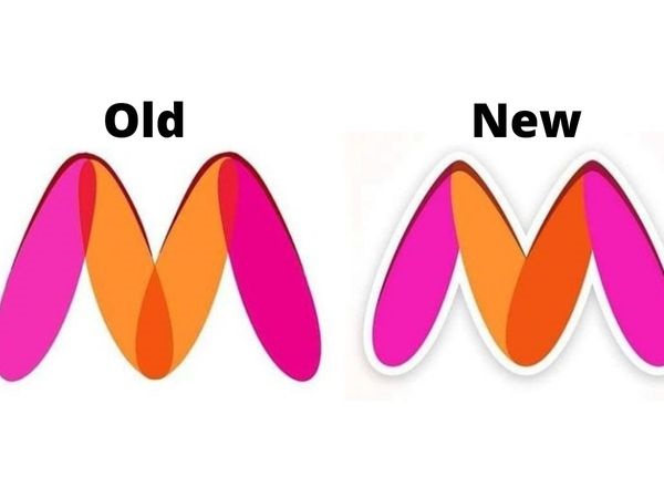
The Controversy of Myntra’s Logo change over “Offensive Remark”
The famous e-commerce brand Myntra has decided to change its logo, after a complaint was filed with the cyber police, Mumbai by Naaz Patel, who is associated with Avesta Foundation NGO.
MYNTRA’S BACKGROUND
Myntra was founded back in 2007, which had been subsequently taken over by Flipkart in 2014 and later merged with e-commerce platform Jabong to expand its business and marketing. It is one of the largest e-commerce stores for fashion and lifestyle products in India.
COMPLAINT FILED
The complaint stated that the official logo of Myntra, was offensive and insulting to woman as it is portraying the visual of a naked woman suggestively depicting her legs in a vulgar manner. They further submitted that the ‘overall placement of colour scheme’, of the letter ‘M’, in the logo was obscene in the eyes of any average person and claimed it was a deliberate attempt to corrupt the minds of the viewers and even excite them which can further lead to unwanted victimization of woman in the society. The complaint had been filed back in December, 2020 following which the police met up with the officials working at the company and concluded that Myntra will change its logo within a period of one month. The Mumbai-based activist even threatened to take legal actions against the company if, the suggested change was not implemented at the earliest.
CURRENT STATUS
Myntra has applied for a multi-class series application for its new logo on 13/01/2021, which has already been accepted by the Indian Trade Marks Registry. The logo is being changed the website, application and on packaging materials. Myntra has even issued new printing orders with the new logo on it. However, they have stated that they would start using the new logo in their packaging and marketing material after exhaustion of the physical pre-printed material with existing logo across India.


INTERNET’S REACTION
Even though, the logo had a minor alteration as compared to the earlier logo, it has put the netizens of social media in splits. As soon as the news of changed Myntra logo came into the light, it became a huge controversy. One group of people favoured and praised the change, whereas the other group criticized the change and pointed out similar brands that could be perceived as offensive in the beholder’s eyes.
People have questioned the authenticity of the complaint and are shocked that why such a famous e-commerce brand, did not put forward their points and succumbed to the complaint to change the logo. Many users have even shown their disappointment with the brand and said that, this decision would welcome unnecessary problems in future as more activists would dig out different logos of brands, and get more unwanted interpretations out of it. The funny part is that, no one noticed the vulgarity in the logo until the complaint had been lodged. Many have reacted to the change in logo with utmost humour and even made memes out of it. Some people have shown their concern for the change and consideration of logos associated with famous brands like GMAIL , DOORDASRSHAN
  , AIRBNB
  , and others.
OUR VIEW
Every alphabet’s interpretation can be twisted and changed as per wish, and if this continues, business houses will have to keep wasting their energy and time on solving these issues based on people’s perception. Earlier, the change of fair and lovely to Glow and lovely, has changed nothing either for company or its customers, that still regards fair is only beautiful. Anything and everything under the sun can be termed offensive, it varies from person to person to perceive the same as offensive.
The re-designed logo of Myntra, do not completely comply with the “offensive remark” of the mark as stated in the complaint. The Trade Marks Registry could have raised an objection pertaining to Section 9(2)(c) [comprises or contains scandalous or obscene matter].
The change in Myntra’s logo is just showing the intolerance and overactive imagination of people. The worst part is all the efforts put in to build the logo and create an impression on the customer’s mind at large has been laid waste for no fault of the company. Myntra was just using a modified M with colours, based on their brand name. The change is only for namesake, and maybe to avoid new controversies Myntra decided to change the logo.


